

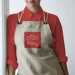
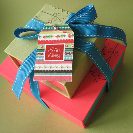
HANDMADE SOPHISTICATION
The Craft Alley is a small atelier that manually creates and produces simple objects with sophisticated finishing. They direct their style towards the clients' taste to come up with unique, personalized items. Every object is one-of-a-kind, with its own creative combination of materials, textures and fabrics. Craft Alley's brand identity balances creativity and simplicity, handmade and sophistication. The logo easily applies over both flat or rich fabric patterns, integrating well with the designs, yet still standing out.

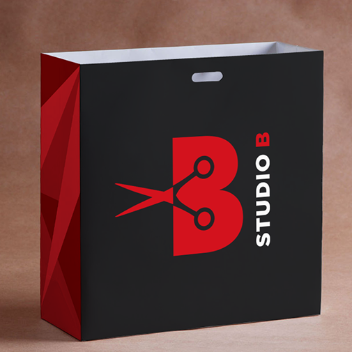
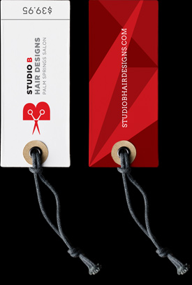
YOUR OWN KIND OF BEAUTIFUL
Studio B Hair Designs provides the excellence in beauty experience, with creative, personalized designs and top beauty-industry products. I was in charge of their brand identity, besides their website (see the project here). Studio B's logo balances simplicity and creativity, with iconic shapes and strong colors. A bold symbol combines their short-name with scissors. It quickly communicates the core of their business and refers to their main stylist, Bianca Spano. A contemporary typeface and punchy colors create a stylish, fashion-industry look.


SUSTAINABLE PLANET
IIS International Institute for Sustainability) is an environmental research institution based in Rio de Janeiro, Brazil. They publish scientific articles and reports that have contributed to global scientific and policy discussions involving climate change, deforestation, biodiversity conservation and food security. IIS’ brand essentially stands for the promotion of global integration between natural and social systems. With a circular blend of humans and birds, IIS’ logo represents their brand vision and the whole sustainability concept itself.

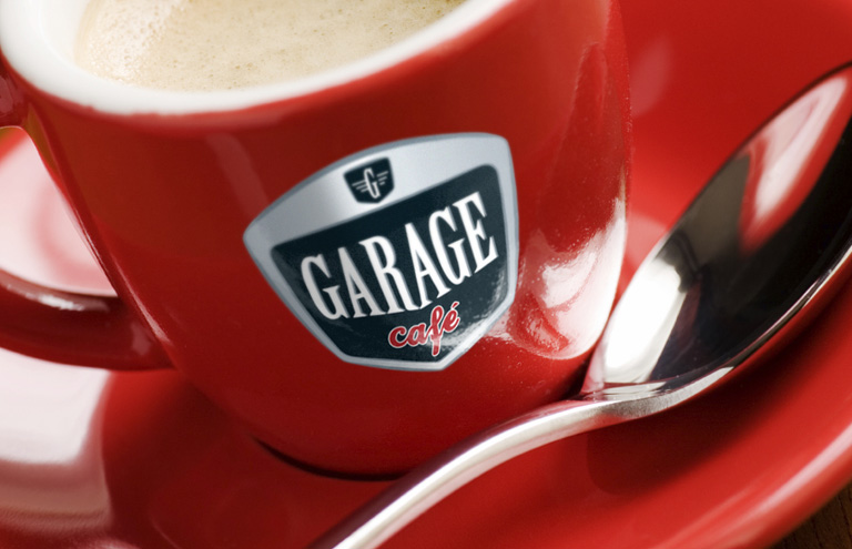
BOLD AND SHINING COFFEE
Garage café opened its shop in Rio de Janeiro, Brazil, with the promise to offer tasty coffees and cookies in a cool environment. The décor is based on antique cars and ranges from thousands of miniature cars to authentic motorcycles hanging from the roof. Their appealing brand identity was inspired by nostalgic chromed car emblems plus 1950’s fonts and colour schemes. It energetically communicates the unique Garage café experience by immersing customers in nostalgia.

TASTY AND
FRIENDLY
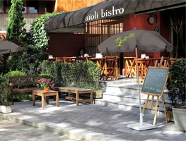
Gardens was once a modest neighborhood restaurant in São Paulo, Brazil. New managers decided to change it’s name to Aioli Bistro and improve their service and menu. I was hired to direct their new branding approach, including the development of a new identity that would communicate those changes. The bistro brand identity was then centred on the welcoming and friendly environment, created by their amicable service and the woody neighborhood. Their logo was created to reflect their simplicity and charm by its unique typography and stylized tree/condiment symbol.


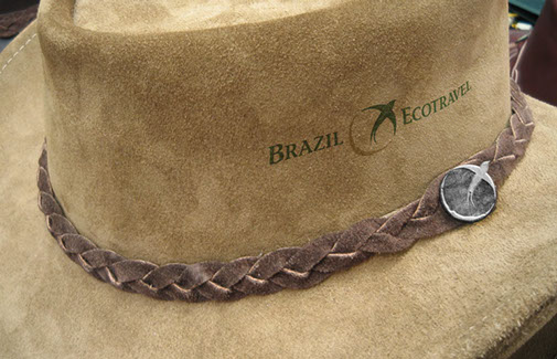
WELL-ORIENTED ADVENTURE
Brazil Ecotravel is a tour operator that offers special interest travel for independent and group travelers. They are committed to promoting environmentally responsible travel and helping conservation efforts in Brazil. With Imaginatto, I was in charge of a complete change in their image. The new Brazil Ecotravel logo is a nice combination of adventure and sophistication, the emotional benefits of the experience that they provide. Their symbol represents an integration with nature, orientation, freedom and exploration.

CURSED CLIMBING
TRIP
After great success and lots of awards of Uruca (2008), Hugo and Felipinho are back in this amazing sequel to face all challenges of alpine climbing. I was responsible for the naming (back in 2008) and the logo of the new movie. "Uruca" is a funny slang meaning "Cursed", so I took some inspiration from black magic chalk texture. I was also influenced by the British Columbia outdoor writing style, since that's where the story runs. I created the lettering from scratch, so it's tailored to capture the sense of adventure, roughness and spontaneity seen in the movie. Uruca II is a short movie by Erick Grigorovski.

BETWEEN ROPES AND HOPES
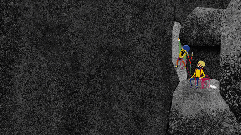
Entre Nós (Between us/knots) is an animation short movie about a 14-year-old girl, on a camping and climbing trip with her father, an experienced and rustic mountaineer. Directed by Erick Grigorovski, the film is centred on the relationship between them, which improves as they face serious challenges. I was in charge of the naming and logo of the movie. The Entre Nós logo (as well as the English version, Between Us) has a unique typeface that reflects their immersion in the rough environment, the rock climbing atmosphere, and the strong tie/knot between them.


FLOURISHING LITERACY
Ideas e Caminhos is a Rio de Janeiro Government program that aims to improve the pedagogical practice. Led by MultiRio, a State-owned TV producer, the project includes interactive classes through videos, web content, and print material. We defined Ideias e Caminho’s brand core as “growing”, which refers to the improvement of teachers’ capacity to teach, as well to the literacy process itself. Young, contemporary, and dynamic, their logo represents the teacher’s power of transformation and the flourishing of knowledge.